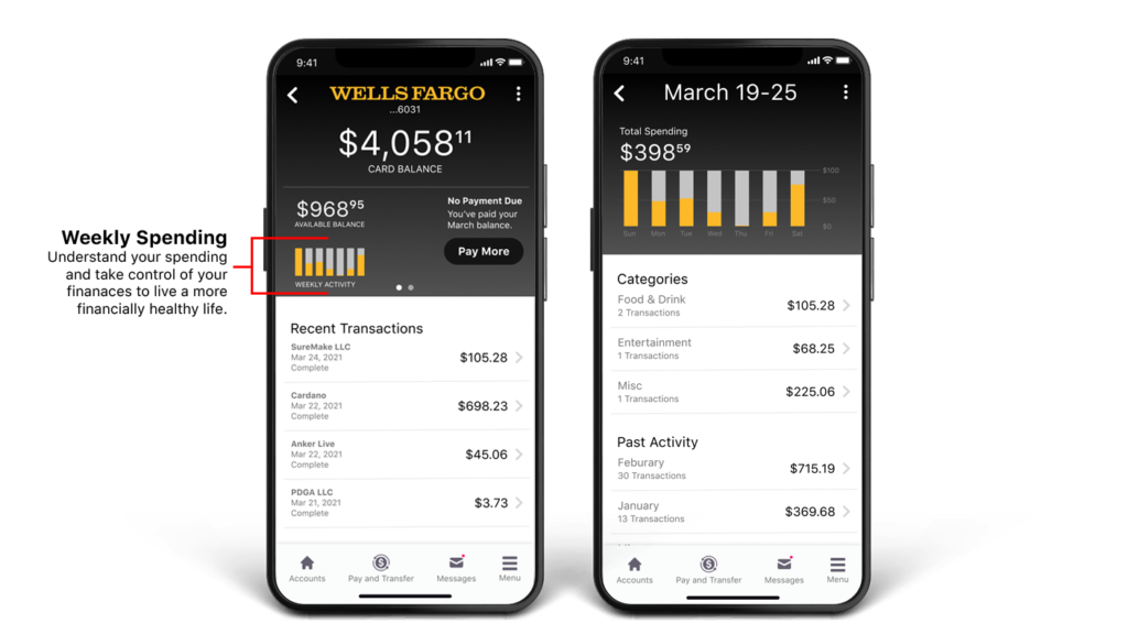
In today’s fast-paced digital landscape, the mobile app experience is paramount in meeting users where they are and providing seamless access to essential financial services. As I embarked on redesigning the Wells Fargo mobile app, my focus was on modernizing the design to prioritize customization and empathy towards the user’s needs and preferences. My goal was to offer quick and intuitive access to information and key areas of the app, ensuring that users could effortlessly navigate to the features most relevant to them. Additionally, the app served as a powerful tool for customers to monitor their spending habits, as it categorized expenditures and provided insightful charts for better financial management. With a dynamic homepage that adapted and improved based on the user’s habits and interactions, I aimed to create a personalized and tailored experience that enhanced usability and satisfaction.
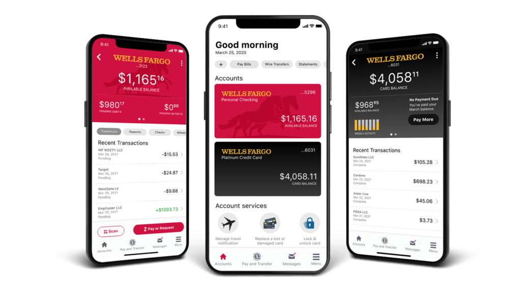






Embarking on the redesign of the Wells Fargo mobile app, I made it a priority to infuse modern design principles rooted in empathy towards the user’s needs and preferences. Leveraging UX heuristics and contemporary design patterns, I sought to create an experience that not only prioritized customization but also resonated deeply with users. With a keen focus on user intent, my goal was to provide quick and intuitive access to information, ensuring seamless navigation to key areas of the app tailored to each user’s unique requirements.
Central to this approach was the recognition that empathy is not only about understanding the user’s needs but also about anticipating them. By integrating modern design patterns that prioritize user-centricity, such as personalized dashboards and contextually relevant content, I aimed to foster a sense of connection and resonance with users. This strategy not only modernized the app’s design but also elevated the overall user experience, aligning seamlessly with Wells Fargo’s commitment to customer satisfaction and convenience.

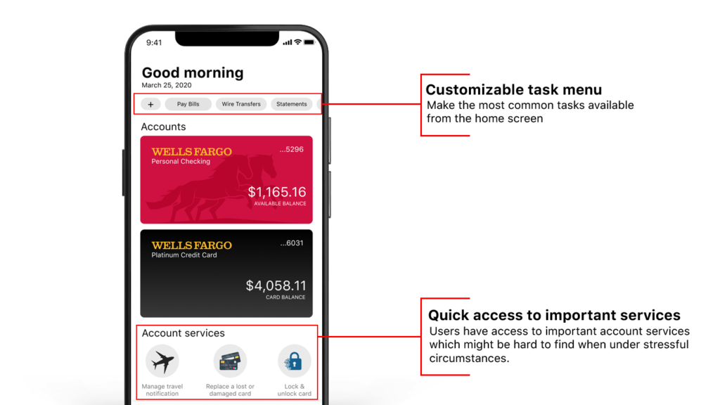
The redesign of the Wells Fargo app’s home page has put user needs at the forefront, focusing on streamlining navigation and providing quick access to essential services. Introducing a customizable task menu ensures users’ most frequent actions are easily accessible, tailored to their preferences. This personalized feature automatically adds shortcuts to commonly performed tasks, alongside custom links added by users. By simplifying the task completion process and minimizing screen navigation, this approach significantly enhances usability and user satisfaction.
Furthermore, the redesign acknowledges the importance of accessing critical account services promptly, especially during stressful situations. The revamped home page now offers direct access to essential functionalities like account management, card services for locking or replacing cards, and customer support. This swift access reduces the time and effort required to address urgent financial needs, ultimately aiming to alleviate user stress and enhance overall user experience within the Wells Fargo app.

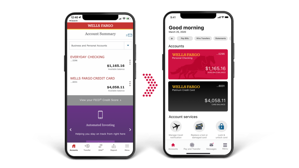
The evolution of the Wells Fargo app design represents a significant transformation from a mere banking tool to a comprehensive financial management solution aimed at empowering users to improve their financial well-being. Initially conceived as a platform for basic banking transactions, the app has evolved to encompass a wide range of features designed to assist users in managing their finances more effectively. This evolution reflects Wells Fargo’s commitment to providing holistic financial solutions and adapting to the changing needs and expectations of its users.
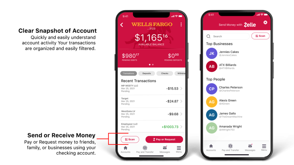
To facilitate this transformation, the app now offers a clear snapshot of account activity, allowing users to quickly and easily understand their financial status at a glance. Transactions are meticulously organized and easily filtered, enabling users to track their spending and identify trends in their financial behavior. This level of detail empowers users to make informed decisions about their finances and take proactive steps towards achieving their financial goals.
Moreover, the app now provides users with the ability to send or receive money to friends, family, or businesses directly from their checking account. This feature streamlines the process of transferring funds, making it convenient for users to manage their finances and conduct transactions seamlessly. Whether paying bills, splitting expenses with friends, or sending money to loved ones, users can rely on the Wells Fargo app to facilitate secure and efficient financial transactions, further enhancing their overall financial management experience.
In the final section of this design, the focus shifts to promoting healthy finances and empowering users to take control of their financial well-being. The app introduces features aimed at providing users with insights into their spending habits, enabling them to understand their financial health and make informed decisions. Weekly spending summaries are presented to users, offering a comprehensive overview of their expenditures and allowing them to track their spending patterns over time. By visualizing their spending in this manner, users can identify areas where they may be overspending and take proactive steps to adjust their budget accordingly.
Furthermore, transactions within the app are categorized, making it easier for users to identify and classify their expenses. This categorization allows users to see where their money is going and gain a deeper understanding of their financial priorities. Additionally, the app provides clear callouts to make payments, ensuring that users can easily initiate transactions and stay on top of their financial obligations. Users are also provided with status updates on their payments, giving them peace of mind and confidence in their financial management efforts. Overall, these features contribute to a more transparent and user-friendly experience, empowering users to make healthier financial choices and achieve greater financial stability.
